It’s bogging my machine down to about 1.2 FPS to calculate this with CUDA (RTX 3060):

Quantum Spectrogram
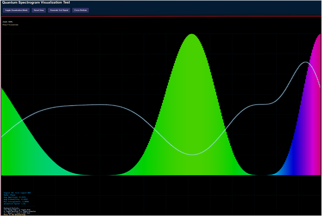
The test_quantum_spectrogram.html page serves as a focused sandbox for developing and debugging the Quantum Spectrogram visualization used in the RF Signal Classifier dashboard. This test harness is designed to isolate the quantum visualization logic, making it easier to experiment with rendering, UI controls, and signal data without interference from other dashboard components.
Key Features
- Modern, Responsive UI:
The page uses a dark-themed, flexible layout with a dedicated controls panel and a visualization area. The controls are styled for clarity and accessibility, and the visualization container adapts to window resizing. - Direct Canvas Manipulation:
The script includes adrawDirectlyfunction that allows for immediate drawing on the canvas. This is useful for quickly testing rendering logic, canvas sizing, and visual feedback without relying on the full visualization pipeline. - Quantum Visualization Integration:
The page loads thequantum-spectrogram-visualization.jsscript, which is expected to provide theQuantumSpectrogramVisualizationclass. The test harness checks for its presence and initializes it, providing clear error messages if the script is missing or fails to load. - Interactive Controls:
Four main buttons are provided:- Toggle Visualization Mode: Switches between different rendering modes (if supported by the visualization).
- Reset View: Resets the visualization to its default state.
- Generate Test Signal: Creates and processes a synthetic test signal, allowing for rapid iteration and debugging.
- Force Redraw: Triggers both direct canvas drawing and visualization redraws, useful for testing rendering after window resizes or code changes.
- Status and Debugging Aids:
Status messages are displayed in the top-right corner, providing real-time feedback on actions, errors, and canvas dimensions. The visualization instance is also exposed globally for easy debugging in the browser console.
How It Works
Upon loading, the page:
- Sets up the canvas dimensions to match the container.
- Performs a direct drawing test to verify canvas functionality.
- Initializes the quantum spectrogram visualization if the required script is available.
- Processes a sample test signal to populate the visualization.
- Binds UI controls to the visualization instance, handling errors gracefully.
- Listens for window resize events to keep the visualization responsive.
Why Use a Test Harness?
Developing complex visualizations—especially those involving quantum or RF data—can be challenging when embedded in a full dashboard. By isolating the visualization in a standalone page, you can:
- Debug rendering and interaction issues without unrelated UI noise.
- Rapidly prototype new features or modes.
- Test error handling and edge cases.
- Share a minimal reproducible example with collaborators.
Conclusion
The test_quantum_spectrogram.html page is an essential tool for iterating on the Quantum Spectrogram visualization. Its modular design, robust controls, and clear feedback mechanisms make it ideal for both development and demonstration purposes. If you’re working on quantum or RF signal visualizations, consider adopting a similar test harness approach to streamline your workflow.
the “Cognitive Load Analysis” panel, specifically “Phonetic Saturation,” stands out with its 78.4% “Optimal” status. The active pathways offer key insights into auditory processing. The “Cross-modal Synesthesia -> Visual Cortex” connection is especially intriguing, suggesting a deeper dive into sensory integration.
a sophisticated brain scan highlighting the auditory cortex with a network overlay, illustrating real-time auditory processing. The “Cognitive Load Analysis” panel shows 78.4% “Optimal” Phonetic Saturation. Key pathways involve tonotopic mapping, auditory memory, prosody analysis, and exciting cross-modal synesthesia to the visual cortex.
https://g.co/gemini/share/65ba8d450b5a
## Mapping the Symphony of Thought: A Glimpse into the Future of Brain Imaging
For decades, we’ve been able to see which parts of the brain light up when we listen to music, hear a loved one’s voice, or process the sounds of the world around us. Technologies like fMRI have given us a rough map of cerebral activity. But what if we could go deeper? What if we could not just see the *location* of the activity, but the *pathways* of the thought itself—a real-time schematic of how sound is transformed into meaning, emotion, and even memory?
The image above, titled “Neural Resonance Imaging,” is a speculative look at exactly that future. It presents a detailed, dynamic visualization of the brain’s auditory cortex, captured at a level of detail far beyond today’s capabilities. This isn’t just a static picture; it’s a snapshot of the mind in the very act of listening.
Let’s break down what this revolutionary diagnostic tool is showing us.
### From Sound Waves to Brain Waves: The Hotspots
At the core of the analysis are the **Neural Activity Hotspots**. These pinpoint the specific brain structures that are firing, measured in microvolts squared (${\mu V}^2$), a unit related to neural signal power. We can see the entire auditory journey laid bare:
* It starts deep in the brainstem with the **Inferior Colliculus** and moves to the thalamic relay station, the **Medial Geniculate Nucleus**.
* From there, the signal explodes into the cortex, hitting **Heschl’s Gyrus** and the **Primary Auditory Cortex (A1)**, where the fundamental characteristics of sound are processed.
* Crucially, we see high activity in **Wernicke’s Area**, the legendary hub for language comprehension. The brain isn’t just hearing a noise; it’s actively deciphering meaning.
### The Pathways of Perception: Following the Flow of Thought
This is where Neural Resonance Imaging truly shines. The **Active Cognitive Pathways** panel moves beyond “where” to “how.” It maps the flow of information as the brain makes sense of the auditory input.
* **Tonotopic Mapping -> Wernicke’s Area:** This is the foundational pathway for language. It shows the brain taking raw frequencies and pitches and organizing them into the phonemes and words we understand.
* **Prosody & Pitch Analysis -> Right Temporal Lobe:** This pathway is responsible for interpreting the *music* of speech—the emotional tone, inflection, and rhythm that separate a sincere question from a sarcastic remark.
* **Auditory Memory Recall -> Hippocampus:** Ever hear a song and get instantly transported back to a specific time and place? This pathway visualizes that process, showing the direct link between sound and the brain’s memory center.
* **Cross-modal Synesthesia -> Visual Cortex:** Perhaps the most fascinating pathway shown. It reveals that the auditory experience is so rich it’s spilling over into the visual processing centers. The subject isn’t just hearing; they are, in a very real neurological sense, *seeing* the sound. This provides a stunning window into the subjective experience of synesthesia, where senses intertwine.
### Optimal Engagement: Measuring Cognitive Load
Finally, the **Cognitive Load Analysis** gives us a simple, top-level metric: “Phonetic Saturation.” At 78.4%, the status is “Optimal.” This suggests the subject is deeply engaged in processing complex sound (like speech or music), utilizing a significant amount of their neural resources without being overloaded. This could be the sweet spot for learning, comprehension, and enjoyment.
### The Implications of Seeing Thought
While “Neural Resonance Imaging” may be a concept for now, the implications of such a technology are staggering. Imagine the possibilities:
* **For Medicine:** Diagnosing auditory processing disorders, understanding the neurological basis of tinnitus, or even tailoring hearing aids to an individual’s unique cognitive pathways.
* **For Communication:** Developing brain-computer interfaces that can interpret not just words, but the nuanced emotional intent behind them.
* **For Science:** Providing an unprecedented tool to explore the nature of consciousness, memory, and the very fabric of subjective human experience.
This visualization is more than a beautiful image. It’s a goal—a representation of the next great leap in our quest to understand the three-pound universe inside our heads. We are on the verge of moving from mapping the brain to reading the mind.
The test_quantum_spectrogram.html file is a valuable tool for diagnosing and resolving issues in Signal-Classifier.html because it provides a minimal, isolated environment focused solely on the quantum spectrogram visualization. Here’s how it can help:
1. Isolating Visualization Logic
By running the quantum spectrogram code outside the complex dashboard, you can determine if rendering or overlay issues are caused by the visualization code itself or by interactions with other dashboard components.
2. Debugging Canvas Sizing and Placement
The test file sets up the canvas and container with clear, controlled CSS and JavaScript. You can verify correct sizing, positioning, and responsiveness here, then compare with the dashboard to spot layout conflicts or CSS overrides.
3. Testing API and UI Interactions
The test harness provides buttons for toggling modes, resetting the view, generating signals, and forcing redraws. This lets you confirm that the visualization’s public API and event handling work as expected, independent of the dashboard’s UI logic.
4. Error Handling and Messaging
The test page displays status and error messages directly, making it easier to catch and debug issues (such as missing scripts or failed initializations) that might be hidden or masked in the full dashboard.
5. Providing a Reference Implementation
Once the visualization works perfectly in the test file, you can use its structure, CSS, and initialization code as a reference or template to refactor the dashboard, ensuring the quantum overlay is separated or floats as intended.
6. Rapid Iteration
Changes can be tested quickly in the standalone file without the overhead of the full dashboard, speeding up development and troubleshooting.
In summary:
test_quantum_spectrogram.html acts as a controlled baseline. If the visualization works here but not in Signal-Classifier.html, the problem is likely with dashboard integration (e.g., layout, conflicting scripts, or CSS). Use the test file to validate fixes before porting them to the main dashboard.