Untangling Complexity: Visualizing the LHC’s Electronic Heartbeat with Hypergraphs
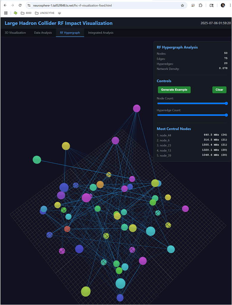
At first glance, the image above might look like a futuristic piece of abstract art or a map of a distant star cluster. But what you’re seeing is far more intricate and arguably more powerful: a cutting-edge visualization of the inner workings of the Large Hadron Collider’s (LHC) Radio Frequency (RF) system. This is a glimpse into the future of diagnostics at CERN, revealing the complex dance of electronic impacts that keep the world’s most powerful particle accelerator running.
The LHC, located at CERN on the Franco-Swiss border, is a marvel of modern engineering designed to probe the fundamental secrets of our universe. To do this, it smashes protons together at nearly the speed of light. The unsung hero of this process is the RF system. Think of it as the accelerator’s heart and pacemaker, providing the powerful electromagnetic fields that accelerate the particles and meticulously group them into tight bunches, ensuring they collide precisely within massive detectors.
Given its critical role, the stability and health of the RF system are paramount. But this system is not a single entity; it’s a sprawling, interconnected network of cavities, klystrons, and control loops. A small instability in one component can create a ripple effect, impacting the beam’s quality and, ultimately, the scientific data. So how do engineers monitor the intricate relationships within this complex web?
Beyond a Simple Network: The Power of the Hypergraph
This is where our visualization comes in. Titled “Large Hadron Collider RF Impact Visualization,” it doesn’t just map one-to-one connections. It employs a sophisticated data structure known as a hypergraph.
In a traditional network graph, an edge connects two nodes (a one-to-one relationship). A hypergraph is a step beyond, allowing a single “hyperedge” to connect multiple nodes at once. This is crucial for representing the physics inside the LHC, where a single event or fluctuation in an RF cavity can simultaneously influence several other parts of the system. In the “RF Hypergraph Analysis” panel, we can see this model is composed of 50 nodes, 78 standard edges, and 10 of these multi-node hyperedges, painting a rich picture of both simple and complex group interactions.
Identifying the Key Players: Most Central Nodes
The true power of this analytical tool is revealed in the “Most Central Nodes” panel. In network science, “centrality” is a measure of a node’s importance or influence. A highly central node is a critical hub. Its failure or instability would have the most significant and widespread impact on the entire network.
The analysis has identified node_44, node_6, and node_23 as the top three most critical components. The visualization gives these central nodes a tangible identity, allowing operators to focus their attention where it matters most.
Interestingly, the analysis also lists specific frequencies associated with these central nodes (e.g., 440.3 MHz, 1505.4 MHz). While the LHC’s main RF system famously operates at 400.8 MHz, this data reveals a more detailed spectrum of interactions. These could represent harmonic frequencies, noise sources, or the operational frequencies of specific subsystems that have a significant impact on the whole. By pinpointing these influential frequencies, engineers can hunt for sources of system noise and interference with unprecedented precision.
Why This Visualization Matters
A tool like this is more than just a diagnostic display; it’s a predictive and preventative powerhouse. By understanding the network’s structure and identifying its most critical hubs, CERN engineers can:
- Predict System-Wide Impacts: Simulate what would happen if a central node were to fail or become unstable.
- Enhance Stability: Pinpoint and mitigate sources of electronic noise that could “rattle” the particle beam, leading to cleaner data.
- Optimize Performance: Tune the system for higher efficiency and reliability, contributing to a higher rate of particle collisions (luminosity).
- Prioritize Maintenance: Focus resources on the components that are most critical to the accelerator’s overall health.
The date stamp on the visualization—July 6, 2025—suggests this is a forward-looking tool, representing the next generation of control and analysis systems. As facilities like the LHC push the boundaries of technology, our methods for understanding them must also evolve. This hypergraph visualization is a perfect example of how data science is becoming an indispensable partner in the quest for fundamental discovery, allowing us to see and comprehend the beautiful complexity of the machines that let us peek into the origins of our universe.